


來好阿里山茶飲包裝設計
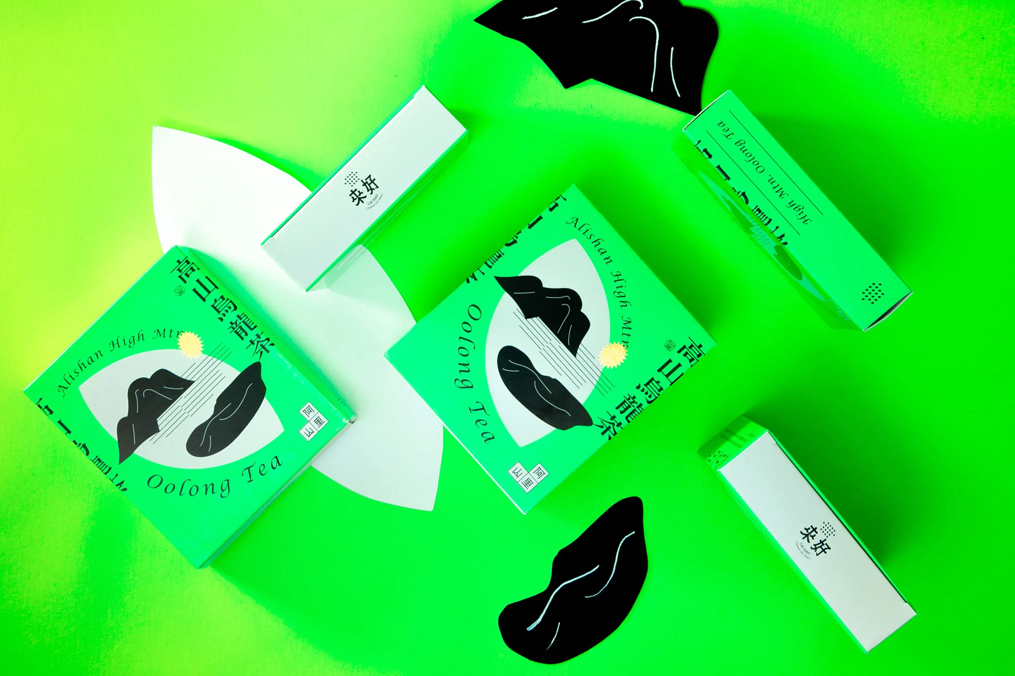
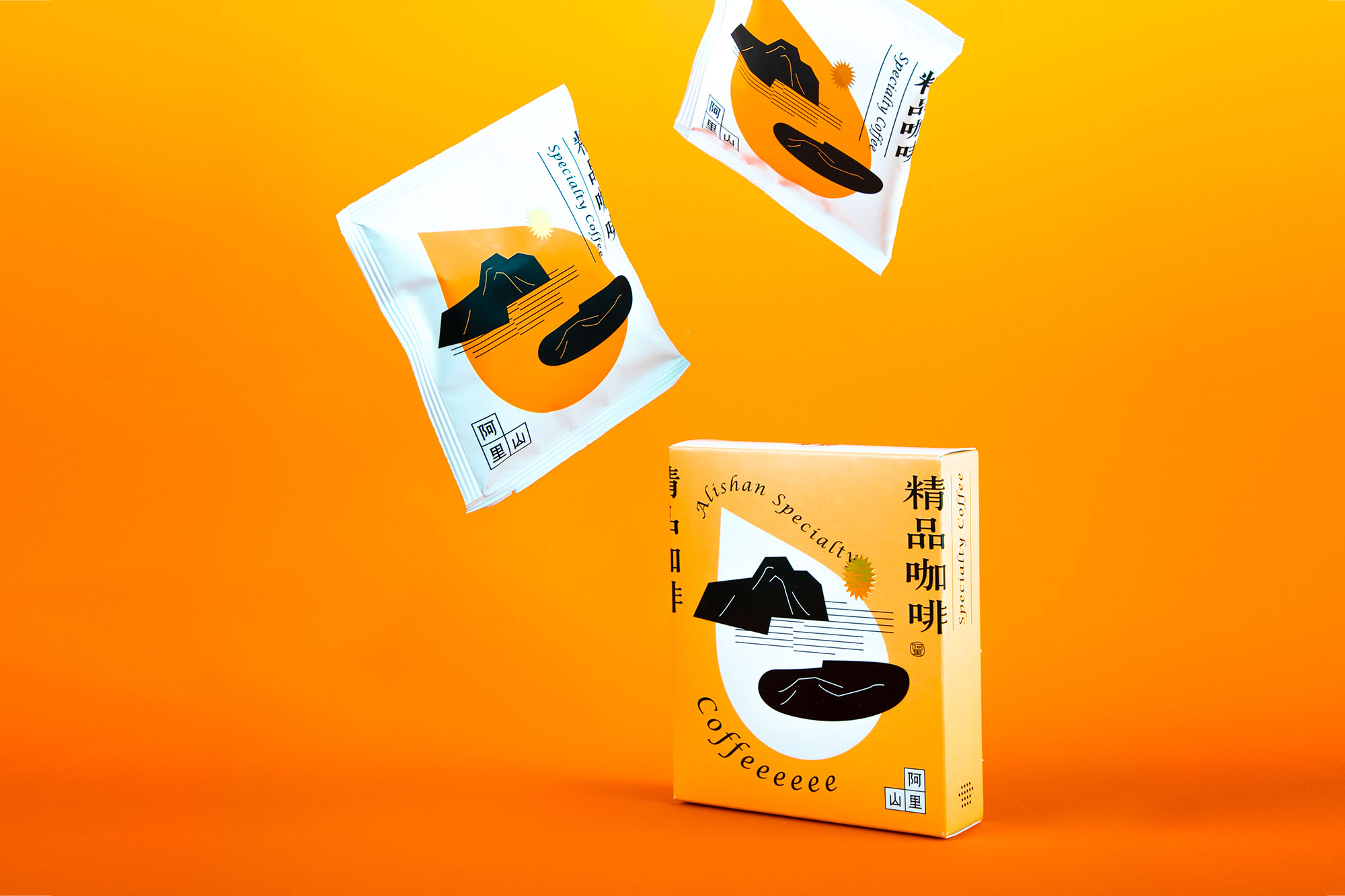
來好以可隨身攜帶的伴手禮為概念,將阿里山的茶與咖啡收入其中,並期望跳脫茶飲類常見的清新日系風格,以更有台味效果來呈現。於是在設計語彙的選用上,我們嘗試拆解了巷弄之間的視覺色系,選用張力十足的螢光色呼應街頭與廟宇戲台常見的色彩,包裝的兩色亦分別對應了咖啡與茶,排版字體則呼應著台灣巷弄招牌毫不含蓄的編排方式以及人情的奔放活力。
另外根據阿里山的命題,繪製了抽象的高山、霧、雲海等素材,除了是為旅人喜愛的自然景色之外,也是阿里山孕育出的咖啡與茶種之所以能獨到的要素。最後再以如特價貼紙又如太陽的造型燙印出阿里山最為人知的金黃日出畫龍點睛,以不同既往的手法呈現新的阿里山飲品包裝。
Lai Hao has created portable souvenirs featuring Alishan tea and coffee, aiming to move beyond the light, Japanese-inspired aesthetic often seen in tea packaging and instead present a more distinctly Taiwanese style. For the design language, we chose vibrant neon colors to echo the bold hues commonly seen on Taiwan’s streets and temple stages. The two packaging colors correspond to coffee and tea, and the typography reflects the unrestrained, lively arrangement of signage found in Taiwan’s alleyways, capturing the warmth and energy of local culture.
Inspired by the theme of Alishan, we illustrated abstract elements such as mountains, mist, and cloud seas—natural scenery beloved by travelers and key to Alishan’s unique coffee and tea varieties. This approach offers a fresh take on Alishan beverage packaging.
Client: 來好
Printer: 艾斯創意印刷 Ice Print
Design by 四木設計 W/H Design Studio